Introduction
In this blog post, I will delve into the creative use of the color brown in modern website designs . I will explore the psychological and emotional impact of brown tones, and how they can show warmth, stability, and reliability to visitors. Along with that, I will provide twelve real world examples of websites right now that effectively utilize the color brown in their design, highlighting the many ways it can be used and aesthetic appeal to the eye of this often under-appreciated and taken for less color. This blog post aims to inspire web developers and designers to consider brown as a valuable and impactful element in their design palettes.
Brown as a Color
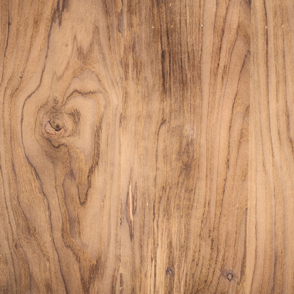
The color brown is often very unappreciated and thought of as a disgusting color. I strongly disagree with this. There are many hues of brown, lights and darks. If you really think about the color brown becomes very versatile and can be used in many different ways. This versatile color is very beautiful and when used right can be very, very appealing to the eye.
Websites that use Brown
There are many websites that use the color brown that have also shown to be very successful.
- UPS Crafts their site for wellness, security and reliability containing multiple factors of relation to their personal branding. They have incorporated the color brown not only in their website deign but also in their uniforms and iconic brown vans.
- Hershey’s utilizes multiple colors pertaining to chocolate which fits admirably well relating to relativity. Brown displays the natural color of chocolate. This color fits with Hershey’s brand. Their use of a milky chocolate color gives a soothing feeling and a sense of reassurance.
- Timberland uses the color brown in a unique type of way. They corporate it in images and their products and create a repetitive color scheme.
- Starbucks incorporates the color brown more as a background color. They use it as a base so other colors along can pop more with their special themes and holiday specials.
- Crate & Barrel being a furniture company that mainly uses wood as a structural component, makes it fitting that they use wood brown colors.
- Pottery Barn is another furniture company. They also make use of the brown wood color palette.
- Whole Foods Market is a food company, they use brown in marketing their food. Brown can be associated with meat, good meat. This adds to the cooked home, ensuring a feeling of reassurance.
- Burt’s Bees uses the color brown in unique ways and has come to achieve good success.
- Levi’s incorporates many neutral colors including brown. This adds to the effect of nonchalant that they are going for.
- Etsy is a versatile website and their way of using brown is different. They use it in the products.
- Patagonia has many colors in use. Brown is one of the colors that keep it stable.
- The North Face is an outdoors brand. The use of brown color in their website creates an outdoors effect and adds to their brands feeling.
Conclusion
The color brown is very versatile and has been used by major websites for great success. In this blog we have seen the positive aspects that this color has brought to websites. Modern websites have been leaning towards neutral colors. Brown is a very stable color. It brings peace and reassurance. Using this color in its respective manner can bring great success. The websites I have listed have gained much respect and are top level websites. I highly encourage all web developers to incorporate this amazing color in their website designs in a respected manner.